 by admin
Seeing Red
Coca Cola, Netflix, Target’s…
What do these 3 brands have in common?
All of them use red in their logos.
If first impressions about people are made around the 1st minute upon laying eyes on them, the same goes to other non-human entities as well – such as brands.
Red is a strong colour that stands out above every other colour it’s paired with, especially blue – and has a tendency to make a strong impression. In this case, the colour makes a strong impression on the brand it represents – such as our brand, Reth!nk.
As you all may or may not remember, we underwent an image revitalisation last year and rejuvenated our brand image from the one we have been using for the past 13 years. This was because the company was evolving (and still is) and we too had to transform our image to better represent our brand.
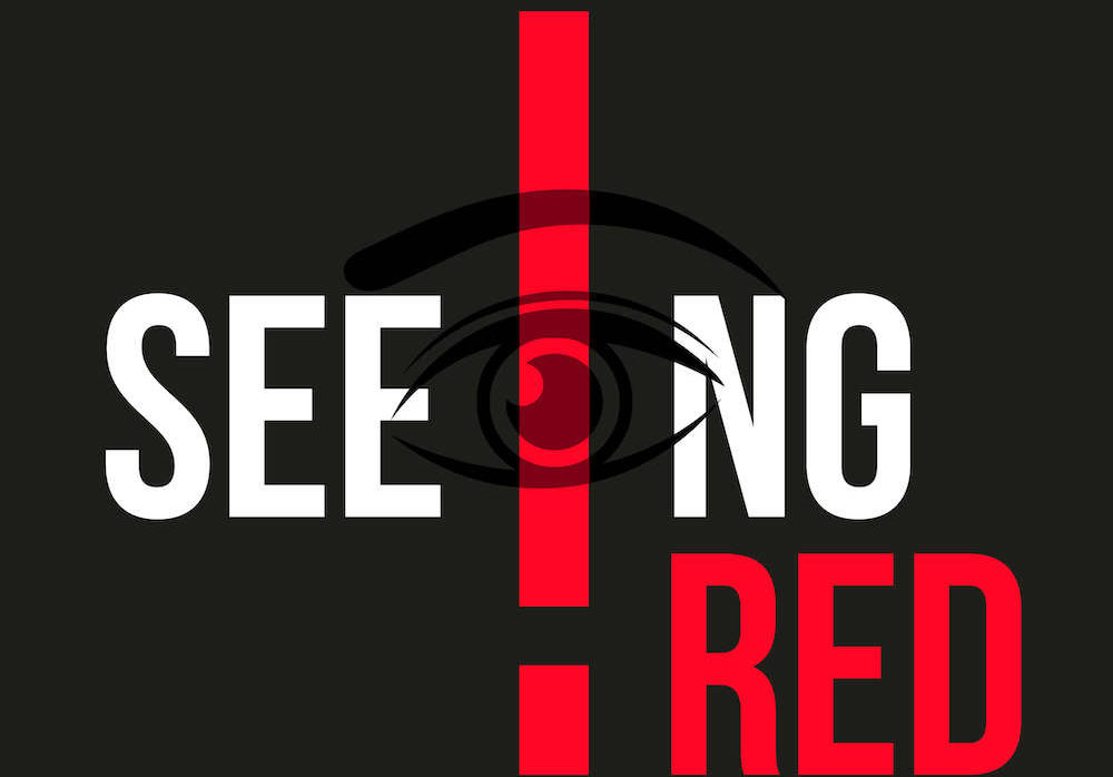
Despite doing away with the other tired old elements, we kept the colour red as the focal point of our brand, along with an exclamation mark stylising the letter ‘i’ (in Reth!nk’) – to punctuate our bold image like the exclamation mark at the end of a loud and clear statement (the ‘loud and clear’ meaning the colour red).
Back to the topic of red being a strong colour, here are the theories behind the reason why red makes such a strong statement:
According to Emily Carter, a web marketing analyst for the Webpage FX, red is associated with increased heart rate, and it’s used to create a sense of urgency. Therefore, most brands use red for clearance sale clothing tags – to make their target audience not hesitate before impulse-buying that flannel shirt at H&M.
Bevil Conway, a neuroscientist and artist with the National eye institute states that the photoreceptors in your eyes are particularly sensitive to long-wavelength light, which we see as red. “There’s an incentive to make logos red because red is the most visible colour”. This is also part of the reason why food brands such as McDonald’s and Kellogg’s use red as their main colour – coupled with the fact that red also plays a role in simulating hunger and appetite .
So there you have it – red is a famous colour in marketing because of all the reasons mentioned above. We hope this provides insight into why we are seeing red in terms of our brand image and the message we hope to communicate to all of you – so you’ll see us, engage in our services, and develop a “hunger” for us for months and years to come.
For starters, we hope you follow us on all our socials for now – to take tiny bites before fully developing that “hunger” to hit us up for our services – which you can find out more about on our LinkedIn.